ShopDreamUp AI ArtDreamUp

Deviation Actions


Suggested Deviants


Suggested Collections


You Might Like…


Featured in Groups


Comments34
Join the community to add your comment. Already a deviant? Log In
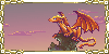
The detail and shading on the dragon is superb. It looks like a fully realized living thing. The pose and expression of the dragon are really well thought out. The clouds and Mountains by comparison do not share a similar style so the effect causes the subject and background to become disjointed. so I gave a low score for Vision.
The originality shines through the pose and anatomy of the dragon. Both are very unconventional and engaging. There is movement and life when too often dragons are shown in very static poses. THIS dragon is a living breathing thing.
Low score on technique because while there is a beautiful dragon in the foreground the same attention and detail seems missing from the background. The mountains and clouds have a smudgy pastel feel while the dragon has very crisp color. The purple in the mountains does not make a smooth transition into the flat grey of the mountains. The sky behind the mountains and clouds also lacks depth. If there was some "colored black" and by that I mean a very dark variation of blue or purple in the sky then it wouldn't clash so much with all of the softer elements in the image. Some sort of gradient in the sky would also help.
High rating for impact because the dragon is flying towards the viewer. But it's attention is off to the side so it leads the viewer's eye OUT of the image when your goal should be to draw their eyes IN to the picture.
Hopefully this critique will be helpful to you. :>